When Photoshop CS6 came out, the change was significant, not only because of the awesome new additions to the program, but because the interface (workspace) was so much darker and more dramatic.
The change in colors was to help the images or graphics “pop” on the user’s screen. Some liked the feature while others did not.
For those who do not like the dark color for your workspace, today I’m going to show you how to change that. This works in Photoshop CS and CC (Creative Suite and Creative Cloud). PSE users, I have something for you at the end.
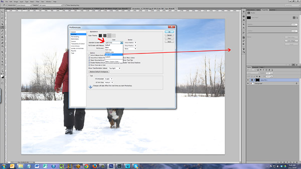
The first step is to access your preference menu. On PC computers, you find that by going to Edit in the top menu, then down to Preferences. On a Mac you click on the word Photoshop in the top-left corner, then down to Preferences.
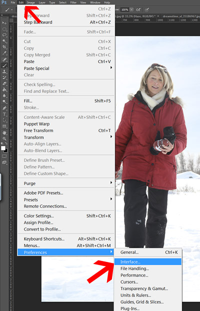
Once your Preference box/menu is open, go to Interface. At the top of the Interface panel, you will see four color boxes, going from almost black to light gray. Click on them one at a time and your screen will change to show that color.
When you have decided which one works best for you, simply hit okay.
Below are examples of the various color schemes that you can choose.
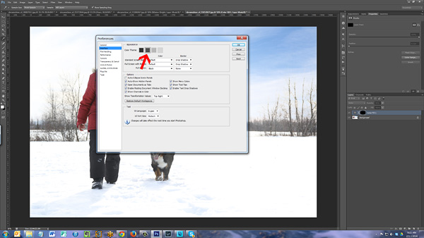
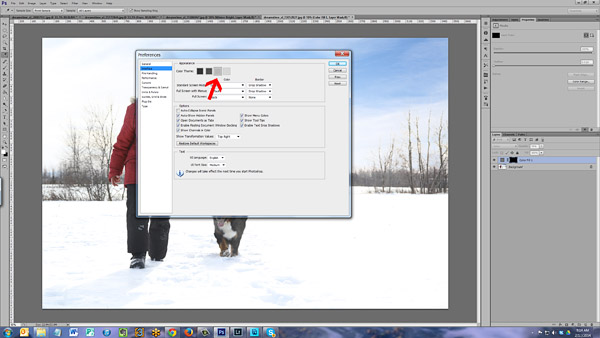
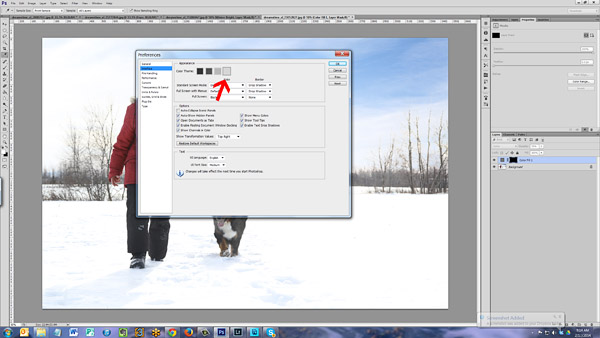
You can also change the color of the area inside, where the image or project is. To change that open your Interface menu again (inside the Preferences menu). Look just below the color boxes you clicked on before, to the drop down menus.
Where it says “Standard Screen Mode,” click on the drop down menu and choose a color. It will change the color around/behind your image (illustrated below).
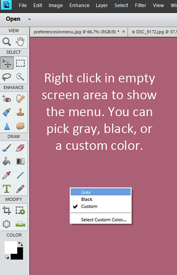
Photoshop Elements users I have bad and good news. Bad news is that you cannot change the color of your entire workspace, but the good news is that you can change the color of the screen area around/behind your image.
Simply right-click over the empty area and a box will open with the choice for gray, black, or custom color. If you choose custom color, then the color picker will open up and you can choose the color.
To illustrate this, I changed my screen color in PSE 11 to pink (I will not keep it that way).
Once you try out some different color schemes for your interface, I’d love to hear what you decided to use.


What a neat tip! Thank you so much for including the PSE info at the end. It’s funny how such a simple thing as the lightness/darkness of the color behind your photos can make such a difference as to how your photos look.
Thanks Amanda, as a PSE user I value all your tips and look forward to more.
Thank you for ALL your wonderful tutorials! They are very easy to understand and I have learned so much from your blog.